Analysis of Singapore’s MRT/LRT passenger flows
Networks
Urban Simulation
Resilience
Complexity
This article uses network science to explore passenger flow patterns in Singapore’s MRT/LRT system and evaluates which stations, and segments matter most.
1. Introduction
With the completion of the Circle Line (CCL) loop on 12 July 2026, Singapore’s MRT/LRT network currently spans just under 280km and will be progressively expanded to about 360km by the early 2030s. When completed, Singapore’s total rail length will exceed that of major cities such as Tokyo or Hong Kong today and will be comparable to that of London and New York1.
On an average weekday, this network successfully carries more than 3.6 million passenger journeys2. Demand is largely bimodal with the morning peak from 7am to 9am, and a broader evening peak between 5pm to 8pm.
Network science provides us with a useful set of tools to study this complex system and understand the patterns behind these flows. The graph model was built earlier conceptualising stations as nodes, tracks as edges, weighted by distance, journey time, and observed passenger flows from LTA’s tap-in/tap-out records in Aug 2026.
This article seeks to address three main questions: (a) where do passengers come from and where are they going, (b) which parts of the network carry this movement, and (c) which segments are most important in the network?
2. Where do passengers come from, and where are they going?
2.1 The daily rhythm
Daily passenger journeys have bimodal peaks. The morning peak (7-9 AM) is more compressed, likely a consequence of fixed school and office start times. The evening peak (5-8 PM) is heavier, and lasts longer over three hours instead of two. Between them sits a midday trough at roughly a third of peak volume. This pattern is broadly consistent across all MRT lines.
2.2 Where do journeys begin and end?
Parsing the origin-destination data from LTA allows us to count the total entries and exits at each station during the AM and PM peak windows.
| Busiest origins | Busiest destinations | |||||
|---|---|---|---|---|---|---|
| Station | Lines | Tap-ins | Station | Lines | Tap-outs | |
| 1 | Yishun | NS | 15,226 | Raffles Place | EW NS | 29,811 |
| 2 | Admiralty | NS | 14,156 | Tanjong Pagar | EW | 17,109 |
| 3 | Woodlands | NS TE | 14,152 | Jurong East | EW NS | 16,794 |
| 4 | Bukit Panjang | BP DT | 14,031 | Novena | NS | 13,573 |
| 5 | Sengkang | NE SK | 13,982 | Outram Park | EW NE TE | 12,620 |
| 6 | Tampines | DT EW | 13,963 | Downtown | DT | 12,435 |
| 7 | Serangoon | CC NE | 13,893 | Kent Ridge | CC | 11,446 |
| 8 | Sembawang | NS | 13,642 | Orchard | NS TE | 11,175 |
| 9 | Lakeside | EW | 12,499 | Newton | DT NS | 10,820 |
| 10 | Khatib | NS | 12,255 | Bugis | DT EW | 10,591 |
| Busiest origins | Busiest destinations | |||||
|---|---|---|---|---|---|---|
| Station | Lines | Tap-ins | Station | Lines | Tap-outs | |
| 1 | Raffles Place | EW NS | 36,838 | Woodlands | NS TE | 24,102 |
| 2 | Jurong East | EW NS | 28,141 | Yishun | NS | 22,201 |
| 3 | Tanjong Pagar | EW | 21,311 | Serangoon | CC NE | 21,964 |
| 4 | Orchard | NS TE | 19,071 | Tampines | DT EW | 21,702 |
| 5 | Bugis | DT EW | 18,379 | Boon Lay | EW | 19,413 |
| 6 | HarbourFront | CC NE | 17,557 | Sengkang | NE SK | 18,834 |
| 7 | Novena | NS | 16,849 | Jurong East | EW NS | 18,595 |
| 8 | Newton | DT NS | 16,124 | Newton | DT NS | 16,100 |
| 9 | Outram Park | EW NE TE | 15,991 | Sembawang | NS | 16,078 |
| 10 | City Hall | EW NS | 15,620 | Bukit Panjang | BP DT | 15,853 |
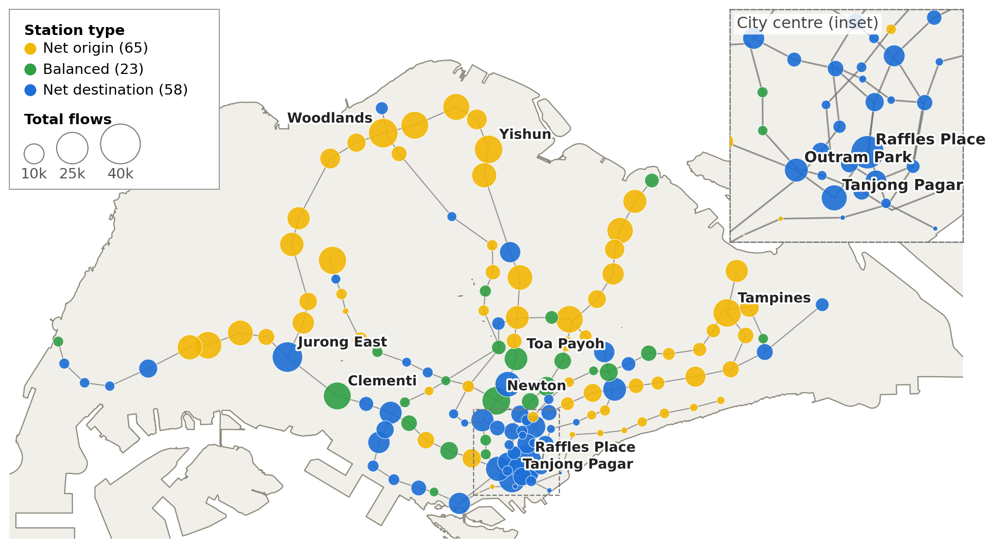
Unsurprisingly, the busiest AM Peak journeys begin from residential towns such as Yishun, Admiralty, Woodlands and Sembawang along the North-South Line, with Sengkang, Tampines, Bukit Panjang and Lakeside following closely. Most AM Peak journeys end in the central business district and surrounding areas.
Passengers originate relatively evenly from residential areas, but flow is concentrated toward a handful of city centre destinations. Yishun, the top origin station, sends 15.2k passengers, only 24% more than tenth-placed Khatib (12.3k). In contrast, Raffles Place receives 29.8k passengers, 1.7 times the next highest destination station (Tanjong Pagar, 17.1k). Two destinations (Jurong East and Kent Ridge) are outside the centre but draw heavy AM Peak arrivals as a second commercial hub and a university-and-science-park cluster, consistent with decentralisation counter-flows.
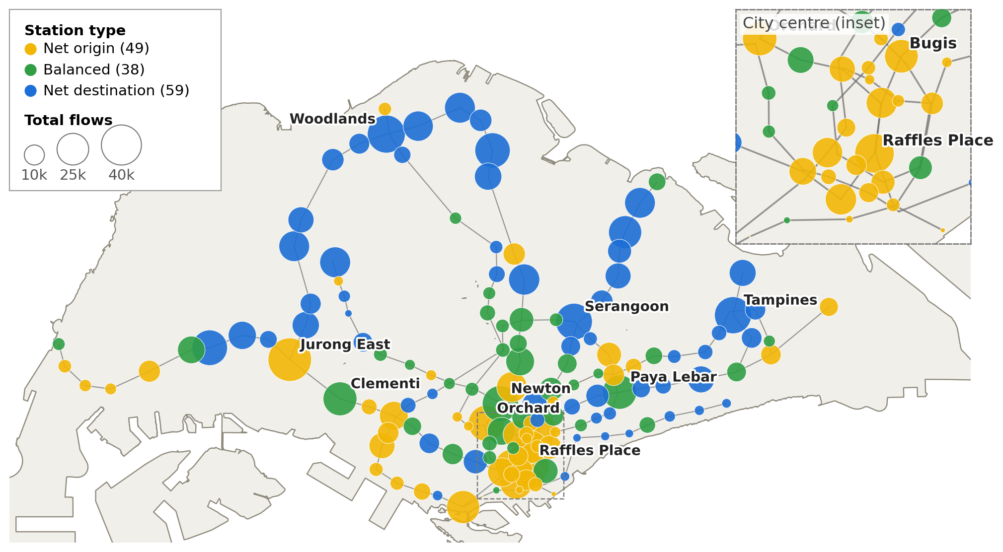
By evening the pattern reverses. Eight of the ten busiest AM Peak destinations become the busiest PM Peak origins, with residential towns the top destinations. Jurong East and Newton are among the top 10 PM Peak origins and destinations, presenting themselves as two-way hubs rather than pure workplaces or residential areas.
2.3 How might we characterise stations?
Plotting tap-ins / tap-outs illustrates (a) how busy a station is (total flows) and (b) whether the station sends or receives more people during AM and PM peak hours.
The spatial distribution of origin (sending) and destination (receiving) stations is visible in Figure 2. During AM Peak, the direction of travel is mainly toward the central areas, with some stations like Newton and Clementi having large but balanced bidirectional flows. During PM Peak, the pattern flips, as evidenced by the color swaps with passengers mainly moving out of the central areas toward residential towns. Newton, Paya Lebar and Clementi have large but balanced bidirectional flows.
3. Which stations and segments are the busiest?
3.1 Assigning flows and calculating throughput
Origin–destination records tell us where each journey starts and ends, but not the route taken in between. To fill this gap, we assume every passenger takes the fastest way — working it out using Dijkstra’s algorithm. Each journey is credited to every segment along its route, and to the station where it changes lines. Add these journeys up gives us the number of people along each segment.
To assess the ‘busyness’ of a station, we measure overall throughput — tap-ins, tap-outs and transfers, which reflects the number of people passing through. This has implications on platform crowding, safety and station design.
3.2 Busiest stations during AM / PM Peak
Looking at the data, interchange stations are the busiest, with transfers accounting for a large share of total passenger flows. The busiest interchanges have intersecting major lines (i.e. North-South (NS) and East-West (EW) lines).
Jurong East stands out with the largest total station throughput, reflecting its critical role in distributing passengers in Western Singapore.
Circle line (CCL) interchange stations also features prominently, reflecting the line’s orbital role in connecting passengers between lines.
- AM Peak: Bishan, Serangoon, Paya Lebar and Buona Vista
- PM Peak: Serangoon, Dhoby Ghaut and Paya Lebar
Thomson-East Coast (TEL) line interchange stations (e.g. Orchard, Woodlands) see relatively less transfers, but could grow in importance with emerging residential areas or as passengers become more familiar with transferring via these stations.
| Station | Lines | Tap-ins | Tap-outs | Transfers | Total | % Trf | |
|---|---|---|---|---|---|---|---|
| 1 | Jurong East | EW NS | 6,263 | 16,794 | 52,603 | 75,660 | 70% |
| 2 | Outram Park | EW NE TE | 3,035 | 12,620 | 50,209 | 65,865 | 76% |
| 3 | Raffles Place | EW NS | 775 | 29,811 | 17,847 | 48,432 | 37% |
| 4 | Bishan | CC NS | 10,538 | 3,483 | 30,198 | 44,219 | 68% |
| 5 | Serangoon | CC NE | 13,893 | 4,902 | 25,273 | 44,068 | 57% |
| 6 | Paya Lebar | CC EW | 5,046 | 8,898 | 20,994 | 34,937 | 60% |
| 7 | Buona Vista | CC EW | 2,833 | 10,128 | 20,796 | 33,757 | 62% |
| 8 | Bukit Panjang | BP DT | 14,031 | 5,658 | 12,903 | 32,593 | 40% |
| 9 | Dhoby Ghaut | CC NE NS | 1,940 | 5,408 | 24,252 | 31,600 | 77% |
| 10 | Woodlands | NS TE | 14,152 | 7,506 | 9,564 | 31,222 | 31% |
| Station | Lines | Tap-ins | Tap-outs | Transfers | Total | % Trf | |
|---|---|---|---|---|---|---|---|
| 1 | Jurong East | EW NS | 28,141 | 18,595 | 68,645 | 115,381 | 59% |
| 2 | Outram Park | EW NE TE | 15,991 | 4,713 | 76,001 | 96,705 | 79% |
| 3 | City Hall | EW NS | 15,620 | 10,516 | 46,213 | 72,349 | 64% |
| 4 | Serangoon | CC NE | 11,284 | 21,964 | 32,324 | 65,572 | 49% |
| 5 | Dhoby Ghaut | CC NE NS | 10,833 | 7,777 | 41,764 | 60,373 | 69% |
| 6 | Paya Lebar | CC EW | 15,502 | 13,507 | 31,312 | 60,322 | 52% |
| 7 | Orchard | NS TE | 19,071 | 13,211 | 26,640 | 58,921 | 45% |
| 8 | Raffles Place | EW NS | 36,838 | 5,669 | 9,500 | 52,007 | 18% |
| 9 | Bishan | CC NS | 7,229 | 7,562 | 34,387 | 49,178 | 70% |
| 10 | Woodlands | NS TE | 11,565 | 24,102 | 12,815 | 48,482 | 26% |
3.3 Busiest line segments
Segments along the North-East line consistently feature the most passengers.
During AM Peak, flows between Hougang to Kovan and Kovan to Serangoon are the highest before some passengers exit at Serangoon to switch to other lines. Nonetheless, overall load remains heavy through toward the city (i.e Woodleigh –> Potong Pasir –> Boon Keng –> Farrer Park –> Little India) before dissipating. More than 60,000 passengers travel through the busiest segment (Kovan to Serangoon), roughly equivalent to the capacity of 440 double decker buses!
The picture is consistent during PM peak, with heavy passenger flows away from the city on the North-East line. The Buona Vista–Dover–Clementi stretch also carries heavy evening flows westward, swelling at Buona Vista as passengers transfer from the Circle Line.
| From | To | Line | Peak direction | Reverse | Peak share | |
|---|---|---|---|---|---|---|
| 1 | Kovan | Serangoon | NE | 60,141 | 8,007 | 88% |
| 2 | Hougang | Kovan | NE | 56,837 | 7,121 | 89% |
| 3 | Farrer Park | Little India | NE | 56,159 | 7,359 | 88% |
| 4 | Boon Keng | Farrer Park | NE | 55,144 | 6,848 | 89% |
| 5 | Woodleigh | Potong Pasir | NE | 54,987 | 7,163 | 88% |
| 6 | Potong Pasir | Boon Keng | NE | 54,809 | 7,005 | 89% |
| 7 | Serangoon | Woodleigh | NE | 54,439 | 7,386 | 88% |
| 8 | Clementi | Dover | EW | 53,265 | 17,860 | 75% |
| 9 | Ang Mo Kio | Bishan | NS | 53,180 | 10,658 | 83% |
| 10 | Little India | Dhoby Ghaut | NE | 52,880 | 7,187 | 88% |
| From | To | Line | Peak direction | Reverse | Peak share | |
|---|---|---|---|---|---|---|
| 1 | Little India | Farrer Park | NE | 67,925 | 18,099 | 79% |
| 2 | Serangoon | Kovan | NE | 67,100 | 17,355 | 79% |
| 3 | Dhoby Ghaut | Little India | NE | 66,691 | 18,764 | 78% |
| 4 | Boon Keng | Potong Pasir | NE | 64,474 | 16,591 | 80% |
| 5 | Potong Pasir | Woodleigh | NE | 64,247 | 16,757 | 79% |
| 6 | Farrer Park | Boon Keng | NE | 64,041 | 17,452 | 79% |
| 7 | Dover | Clementi | EW | 63,624 | 32,243 | 66% |
| 8 | Buona Vista | Dover | EW | 63,223 | 33,067 | 66% |
| 9 | Woodleigh | Serangoon | NE | 63,042 | 17,130 | 79% |
| 10 | Kovan | Hougang | NE | 62,328 | 15,866 | 80% |
4. Which parts of the network are most important?
While Sections 2 and 3 show which stations and segments have the highest volume, passenger traffic alone does not define system criticality. A low-volume station may serve as a single point of failure between two major hubs, while a high-traffic station might have close substitutes. Network science provides several measures to evaluate topological importance and identify components that maintain system connectivity.
4.1 An overview of centrality measures
Betweenness centrality counts how often a station lies on the path between two others. A station with high betweenness is a broker: passengers pass through it on their way somewhere else, and if it closed, their journeys would have to be rerouted. Interchanges tend to score highly, but so do stations at structural pinch points, where a single stretch of track is the only connection between two parts of the network.
Closeness centrality measures how near a station is to everywhere else, on average. A station with high closeness is well placed — journeys from it reach the rest of the network quickly.
Both measures are built on shortest paths, so the results depend on how “shortest” is defined and which journeys are counted. We compute each three ways:
- Topological structure. Every stretch of track is equal, and the measures reflect the shape of the network.
- Weighted by travel time. The shortest path is the quickest one. Transfer penalties at interchanges are taken into account.
- Weighted by passenger demand. For betweenness, each pair of stations is counted by the number of journeys actually made between them, so a station scores highly when it lies on routes many people travel. Closeness has no meaningful demand-weighted form and hence we do not report the computations.
4.2 What the rankings show
Topological network. On the unweighted network, eight of the ten stations with the highest betweenness centrality are Circle Line interchanges (Buona Vista, Botanic Gardens, Bishan, Serangoon, MacPherson, Caldecott, Paya Lebar and Marina Bay). The Circle Line is orbital, crossing every radial line. In a network where every stop counts equally it offers the shortest way between any two lines without passing through the city centre. Outram Park tops the list as the meeting point of three lines on the edge of the central business district. Closeness tells a different story where the best-placed stations (Little India, Newton, Dhoby Ghaut, Rochor and Bugis) sit around the geographic centre of the network, a similar number of stops from everywhere.
Travel time weighted. Once paths are measured in minutes, stations near the city centre rise in ranking. Several Circle Line interchanges fall away from the top of the betweenness ranking. Serangoon and Bishan fall in rank, as routes that save a stop but cost a transfer lose their advantage. Chinatown climbs thirteen places. The closeness ranking shifts more significantly, the geographic centre gives way to the southern CBD, and three Thomson–East Coast Line stations with no interchange (Havelock, Maxwell and Great World) climb twenty or more places. On the newest line, running directly through the heart of the city, a station can reach much of the network quickly without changing trains. Dhoby Ghaut, despite serving three lines, slips five places. An interchange gives options, but come with a cost in transfer time. As such, a station near several interchanges, on a direct line, can outperform one that is itself an interchange.
Passenger demand weighted. Counting the journeys people actually make, Outram Park remains first, and Serangoon, Bishan and Buona Vista stay near the top. However, the rest of the list now features stations along corridors identified in Section 3. Dhoby Ghaut rises eleven places, City Hall twelve, and two ordinary stops with no interchange at all, Dover and Clementi, climb ten places each. They have no structural reason to rank highly, but sit on the single East-West Line corridor carrying the west’s AM Peak commute into the city, so a large share of all journeys pass through them. Closeness is not computed for this layer.
| Betweenness | Closeness | |||||
|---|---|---|---|---|---|---|
| Station | Lines | Station | Lines | |||
| 1 | Outram Park | EW NE TE | Little India | DT NE | ||
| 2 | Buona Vista | CC EW | Newton | DT NS | ||
| 3 | Botanic Gardens | CC DT | Dhoby Ghaut | CC NE NS | ||
| 4 | Bishan | CC NS | Rochor | DT | ||
| 5 | Serangoon | CC NE | Bugis | DT EW | ||
| 6 | MacPherson | CC DT | Stevens | DT TE | ||
| 7 | Caldecott | CC TE | City Hall | EW NS | ||
| 8 | Paya Lebar | CC EW | Botanic Gardens | CC DT | ||
| 9 | Marina Bay | CC NS TE | Clarke Quay | NE | ||
| 10 | Little India | DT NE | Caldecott | CC TE | ||
| Betweenness | Closeness | |||||
|---|---|---|---|---|---|---|
| Station | Lines | Change | Station | Lines | Change | |
| 1 | Outram Park | EW NE TE | – | Outram Park | EW NE TE | ▲ 10 |
| 2 | Buona Vista | CC EW | – | Havelock | TE | ▲ 20 |
| 3 | MacPherson | CC DT | ▲ 3 | Chinatown | DT NE | ▲ 9 |
| 4 | Chinatown | DT NE | ▲ 13 | Maxwell | TE | ▲ 28 |
| 5 | Paya Lebar | CC EW | ▲ 3 | Great World | TE | ▲ 25 |
| 6 | Bishan | CC NS | ▼ 2 | City Hall | EW NS | ▲ 1 |
| 7 | Marina Bay | CC NS TE | ▲ 2 | Tanjong Pagar | EW | ▲ 12 |
| 8 | Jurong East | EW NS | ▲ 6 | Dhoby Ghaut | CC NE NS | ▼ 5 |
| 9 | Serangoon | CC NE | ▼ 4 | Orchard | NS TE | ▲ 5 |
| 10 | Stevens | DT TE | ▲ 2 | Raffles Place | EW NS | ▲ 3 |
| Betweenness | |||
|---|---|---|---|
| Station | Lines | Change | |
| 1 | Outram Park | EW NE TE | – |
| 2 | Serangoon | CC NE | ▲ 7 |
| 3 | Buona Vista | CC EW | ▼ 1 |
| 4 | Dhoby Ghaut | CC NE NS | ▲ 11 |
| 5 | Bishan | CC NS | ▲ 1 |
| 6 | Jurong East | EW NS | ▲ 2 |
| 7 | Little India | DT NE | ▲ 7 |
| 8 | Dover | EW | ▲ 10 |
| 9 | City Hall | EW NS | ▲ 12 |
| 10 | Clementi | EW | ▲ 10 |
4.3 Three kinds of importance
The three layers broadly separate stations into three groups.
- Important on every measure. Outram Park, Buona Vista, Bishan and Serangoon rank highly whether the network is judged by its shape, its speed or its usage. These are the stations where structural position and actual demand coincide, and where any disruption would be felt most widely.
- Important by position, less intensely used. Botanic Gardens, Caldecott, MacPherson, Paya Lebar and Marina Bay, which are all Circle Line interchanges, matter in the structure of the network but drop out once demand is counted. They represent orbital connections the network has but does not yet fully rely on during the AM peak, routes that could absorb passengers diverted from a disrupted radial line.
- Important by use, not position. Dover and Clementi rank lower on structure but high on demand. Their importance comes from the volume funnelled through them rather than from any unique place in the network. A corridor that carries heavy demand with few nearby alternatives is where a disruption would cause the most difficulty.
The contrast between the first and last groups is notable. While topology alone places emphasis on interchanges, actual demand shows that some of the stations the network relies on most are ordinary stops on busy single-line corridors.
| Structure | Travel time | Demand | |||||
|---|---|---|---|---|---|---|---|
| Station | Lines | Btw | Cls | Btw | Cls | Btw | Total |
| Outram Park | EW NE TE | ✓ | ✓ | ✓ | ✓ | 4 | |
| Serangoon | CC NE | ✓ | ✓ | ✓ | 3 | ||
| Buona Vista | CC EW | ✓ | ✓ | ✓ | 3 | ||
| Dhoby Ghaut | CC NE NS | ✓ | ✓ | ✓ | 3 | ||
| Bishan | CC NS | ✓ | ✓ | ✓ | 3 | ||
| Little India | DT NE | ✓ | ✓ | ✓ | 3 | ||
| City Hall | EW NS | ✓ | ✓ | ✓ | 3 | ||
5. Conclusion
My overall take is that the numbers mostly confirm what anyone who rides the MRT already feels. Each morning, passengers pour out of residential towns and converge on a handful of stations in the city centre, and each evening the whole pattern runs in reverse. The North East Line carries the heaviest of that tide, with trains far fuller in one direction than the other.
What surprised me most was how differently each station looks depending on how you measure its network importance. Measured by topology alone, the Circle Line interchanges stand out as the stations that knit everything together. Measured by how people actually travel, the spotlight moves to the busy radial corridors, including stations like Dover and Clementi that matter simply because so many journeys pass through them. Outram Park ranks near the top on almost every measure, with Buona Vista, Bishan and Serangoon close behind as the network’s most consistent brokers. These stations merit close attention from a resilience and reliability perspective.
There are limits to all this. The model assumes everyone takes the fastest route and is based on monthly aggregated data. But it does raise a question worth exploring next - what happens to these journeys when one of these key stations is disrupted? With the Circle Line loop now complete, it would also be interesting to see whether those orbital connections start carrying more of the load in the months ahead.
This article was written in tandem with coursework for the CASA0002 Urban Simulation module.
References
Barabási, A.-L. (2025) Network Science by Albert-László Barabási. Available at: http://networksciencebook.com/ (Accessed: September 10, 2026).
CNA (2026) “Blending form and function: A first look at 3 new MRT stations that will close the Circle Line loop - CNA,” Channel News Asia. Available at: https://www.channelnewsasia.com/singapore/circle-line-cantonment-price-edward-road-keppel-mrt-stations-first-look-6172836 (Accessed: September 10, 2026).
GeekforGeeks (2026) “Find Shortest Paths from Source to all Vertices using Dijkstra’s Algorithm,” GeeksforGeeks. Available at: https://www.geeksforgeeks.org/dsa/dijkstras-shortest-path-algorithm-greedy-algo-7/ (Accessed: September 10, 2026).
LTA (2015) “Train Station Chinese Names LTA data.gov.sg.” Available at: https://data.gov.sg/datasets/d_d312a5b127e1ae74299b8ae664cedd4e/view (Accessed: September 10, 2026).
LTA (2026) “LTA Dynamic Datasets.” Available at: https://datamall.lta.gov.sg/content/datamall/en/dynamic-data.html#Public%20Transport (Accessed: September 10, 2026).
NetworkX (2025) “NetworkX — NetworkX documentation.” Available at: https://networkx.org/en/ (Accessed: September 10, 2026).
OSM (2026) “Singapore/Rail Transport - OpenStreetMap Wiki.” Available at: https://wiki.openstreetmap.org/wiki/Singapore/Rail_Transport (Accessed: September 10, 2026).
URA (2026) “Master Plan 2025 Planning Area Boundary (No Sea) URA.” Available at: https://data.gov.sg/datasets/d_2cc750190544007400b2cfd5d7f53209/view (Accessed: September 10, 2026).