Network Models: Evaluating the resilience of the London Underground Network
Networks
Urban Simulation
Resilience
Complexity
An application of network science to evaluate the resilience of the London Underground network
1. Objective
This analysis applies concepts in network science to evaluate the resilience of the London Underground. We examine the differences when we look at the network topologically and when weighted by observed passenger flows. The study then rounds off by simulating station closures, to identify which stations have the most significant impact on the network.
2. Background
Network science began with a puzzle about a city. In 1736, Leonhard Euler was asked whether one could cross all seven bridges of the Königsberg exactly once. His answer, that this depended not on the bridges’ lengths or the city’s layout, but on how the landmasses connected, established a founding insight of graph theory: structure alone determines what a system permits (Barnett, 2009).
The method is surprisingly simple. Represent a system as nodes joined by edges, and much of its behaviour becomes calculable. For a transit network, the translation is natural: stations are nodes, track between them edges. This gives a topological network, a map of connectivity, indifferent to distance or demand, which isolates what the system’s shape alone implies about where it is fragile.
But structure is only half the story. A station may sit at a critical junction and carry almost nobody while another may lie on an unremarkable stretch of line and move tens of thousands each morning. Attaching passenger volumes to edges produces a weighted network, shifting the question from how a system is built to how it is actually used.
Resilience can be further understood through the concept of centrality which asks the question “which nodes matter most”. Depending on the objective, a station might be important because many lines meet there, because a disproportionate share of journeys must route through it, or because it sits close to everywhere else.
3. Network Centrality Measures
Centrality measures (Newman, 2010) can be computed for the underground network as follows:
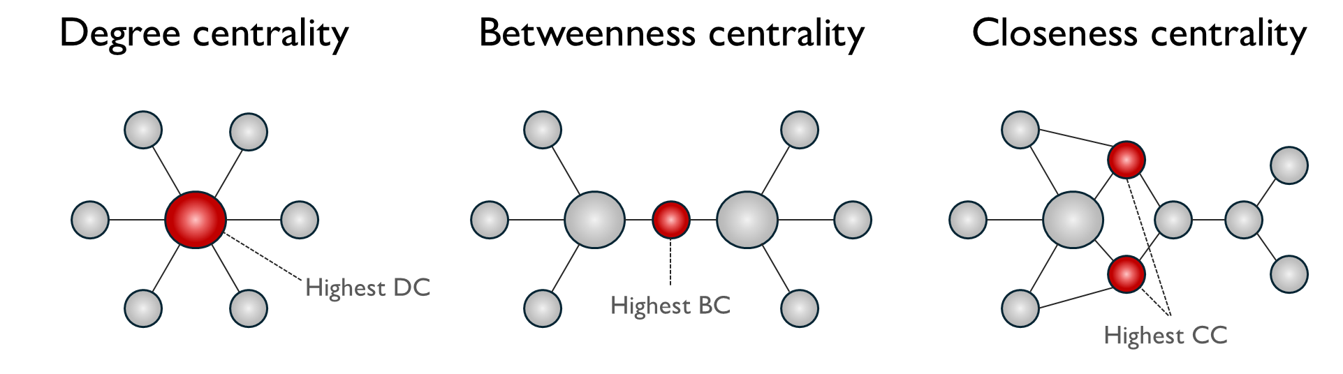
Degree Centrality counts the number of direct connections a node has, reflecting its immediate prominence in the network. For a node v in graph G with N nodes, it can be represented as:
\[ C_D(v) = \frac{deg(v)}{N-1} \]
where \(deg(v)\) is the number of edges that are incident to \(v\) and the denominator normalises by the maximum possible degree. Degree centrality identifies underground stations with the most number of direct line connections such as interchanges (e.g. King’s Cross St. Pancras station with six lines). High degree nodes are critical because they are the primary points of passenger transfer between lines. When a high-degree station fails, passengers lose multiple routing options.
Betweenness Centrality measures how frequently a node lies on the shortest path between other node pairs. It can be represented as
\[ x_i = \sum_{s \neq i \neq t} \frac{\sigma_{st}(i)}{\sigma_{st}} \]
where \(\sigma_{st}\) is the total number of shortest paths between nodes \(s\) and \(t\), \(\sigma_{st}(i)\) is the number of those paths passing through node \(i\), and the condition \(s \neq i \neq t\) indicates that \(i\) is an intermediate node rather than an endpoint. Betweenness centrality identifies stations that act as ‘bridges’ or ‘brokers’ in the underground network where a disproportionate share of journeys must pass through to find the shortest route. They sit at structurally pivotal positions in the network geography and bridge between two otherwise weakly connected clusters. High betweenness centrality nodes are critical because their removal would force many passengers onto less efficient alternative routes or eliminate viable routes altogether.
Closeness Centrality measures how close a node is to all other nodes in the network, based on the sum of shortest path distances. It can be represented as:
\[ C_i = \frac {1}{l_i} = \frac {n}{\sum_j d_{ij}} \]
where \(d_{ij}\) us the length of a geodesic path from \(i\) to \(j\) and \(l_i\) is the mean geodesic distance from \(i\) to \(j\), averaged over all vertices in the network. Closeness centrality identifies underground stations from which the entire network is most efficiently reachable which minimise expected travel time or transfers to any destination. From a resilience perspective, high closeness stations are crucial because their failure degrades network-wide accessibility most severely. When a high-closeness station closes, average journey lengths across the entire network increase substantially.
4.1 Topological Network
The topological measure of the network reflects the infrastructural view of the network with stations as nodes and connecting lines as unweighted edges. While this allows us to identify structurally important stations based on network position, it may abstracts away information (e.g. distance, passenger flows) that could matter more.
| Degree Centrality | Betweenness Centrality | Closeness Centrality | |||
|---|---|---|---|---|---|
| 1 | Stratford | 1 | Stratford | 1 | Green Park |
| 2 | Bank and Monument | 2 | Bank and Monument | 2 | Bank and Monument |
| 3 | King’s Cross St. Pancras | 3 | Liverpool Street | 3 | King’s Cross St. Pancras |
| 4 | Baker Street | 4 | King’s Cross St. Pancras | 4 | Westminster |
| 5 | Green Park | 5 | Waterloo | 5 | Waterloo |
| 6 | Liverpool Street | 6 | Green Park | 6 | Oxford Circus |
| 7 | Oxford Circus | 7 | Euston | 7 | Bond Street |
| 8 | Waterloo | 8 | Westminster | 8 | Angel |
| 9 | West Ham | 9 | Baker Street | 9 | Farringdon |
| 10 | Earl’s Court | 10 | Finchley Road | 10 | Moorgate |
4.2 Scenario Analysis - Topological node removal
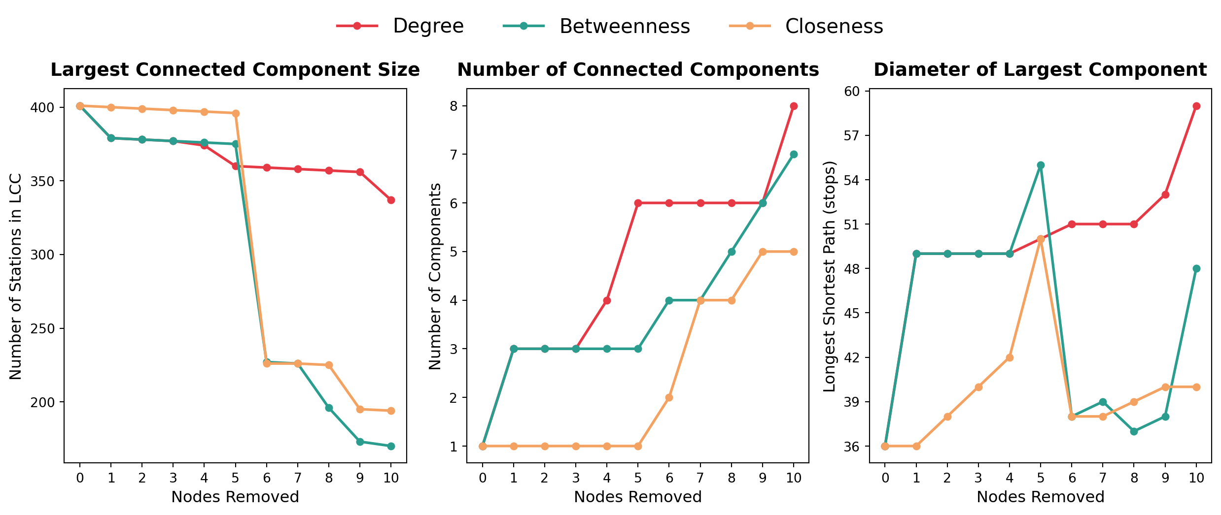
To investigate the resilience of the topological network, we sequentially remove the highest ranked node (by each centrality measure) and evaluate the impact on the (a) number of connected components, (b) largest connected component, (c) diameter of the largest connected component.
| Metric | What it measures | What a change signals |
|---|---|---|
| Number of connected components | How many separate sub-networks the system has fractured into. A value of 1 means every station remains reachable from every other. | An increase means the network has broken apart: some stations can no longer be reached from others by tube at all. |
| Size of the largest connected component (LCC) | The number of stations in the biggest remaining intact sub-network. | A sharp fall means the removal has severed a substantial portion of the network, not merely trimmed its edges. |
| Diameter of the largest connected component | The longest shortest path within that sub-network — the number of stops between its two most distant stations. | An increase means journeys have become less direct: the network still holds together, but passengers must travel further to cross it. |
| Iteration | Node Removed | LCC Size | No. of Components | Diameter of LCC |
|---|---|---|---|---|
| 0 | — | 401 | 1 | 36 |
| 1 | Stratford | 379 | 3 | 49 |
| 2 | Bank and Monument | 378 | 3 | 49 |
| 3 | King’s Cross St. Pancras | 377 | 3 | 49 |
| 4 | Baker Street | 374 | 4 | 49 |
| 5 | Canning Town | 360 | 6 | 50 |
| 6 | Green Park | 359 | 6 | 51 |
| 7 | Earl’s Court | 358 | 6 | 51 |
| 8 | Waterloo | 357 | 6 | 51 |
| 9 | Turnham Green | 356 | 6 | 53 |
| 10 | Willesden Junction | 337 | 8 | 59 |
| Iteration | Node Removed | LCC Size | No. of Components | Diameter of LCC |
|---|---|---|---|---|
| 0 | — | 401 | 1 | 36 |
| 1 | Stratford | 379 | 3 | 49 |
| 2 | King’s Cross St. Pancras | 378 | 3 | 49 |
| 3 | Waterloo | 377 | 3 | 49 |
| 4 | Bank and Monument | 376 | 3 | 49 |
| 5 | Canada Water | 375 | 3 | 55 |
| 6 | West Hampstead | 227 | 4 | 38 |
| 7 | Earl’s Court | 226 | 4 | 39 |
| 8 | Shepherd’s Bush | 196 | 5 | 37 |
| 9 | Euston | 173 | 6 | 38 |
| 10 | Baker Street | 170 | 7 | 48 |
| Iteration | Node Removed | LCC Size | No. of Components | Diameter of LCC |
|---|---|---|---|---|
| 0 | — | 401 | 1 | 36 |
| 1 | Green Park | 400 | 1 | 36 |
| 2 | King’s Cross St. Pancras | 399 | 1 | 38 |
| 3 | Waterloo | 398 | 1 | 40 |
| 4 | Bank and Monument | 397 | 1 | 42 |
| 5 | West Hampstead | 396 | 1 | 50 |
| 6 | Canada Water | 226 | 2 | 38 |
| 7 | Stratford | 226 | 4 | 38 |
| 8 | Earl’s Court | 225 | 4 | 39 |
| 9 | Shepherd’s Bush | 195 | 5 | 40 |
| 10 | Oxford Circus | 194 | 5 | 40 |
The results reveal differences in how each measure identifies vulnerable stations and the severity of degradation following removal.
Degree centrality targets the most connected interchange stations. Its effect on the largest component is gradual (337 stations retained after 10 removals), but it fragments the network more than either alternative, producing 8 separate components and stretching the surviving diameter furthest, from 36 to 59 stops. Removing well-connected hubs shears off peripheral branches without severing the core.
Betweenness centrality identifies broker stations lying on the greatest number of shortest paths. Early removals produce similar degradation to degree, but removing West Hampstead at iteration 6 cuts the LCC from 375 to 227 stations in a single step. The accompanying fall in diameter, from 55 to 38, is not an improvement: the network has shed its longest branches into separate fragments rather than becoming more compact. Broker stations are distinctive because they act as sole connectors between otherwise separate segments, so their failure causes disproportionate connectivity loss.
Closeness centrality targets stations that anchor overall network efficiency. Its first five removals leave the network entirely intact, with the diameter expanding steadily from 36 to 50 stops. Removing Canada Water at iteration 6 then collapses the LCC from 396 to 226 stations, showing that a network can absorb sustained degradation before failing abruptly.
These distinctions carry direct policy implications. High-betweenness stations (King’s Cross, West Hampstead, Euston) represent structural failure risks requiring contingency planning and route redundancy. High-closeness stations (Green Park, Waterloo, Bank and Monument) anchor system-wide efficiency, and their disruption warrants demand-management strategies even where connectivity remains intact. Betweenness centrality is the most operationally useful single measure for identifying catastrophic failure points, but it should be monitored alongside closeness centrality, which captures the slower degradation in journey times that fragmentation metrics miss entirely.
5.1 Weighted Network (Flows)
| Weighted Degree | Weighted Betweenness | Weighted Closeness | |||
|---|---|---|---|---|---|
| 1 | Bank and Monument | 1 | Green Park | 1 | Green Park |
| 2 | Green Park | 2 | Bank and Monument | 2 | Westminster |
| 3 | Waterloo | 3 | Waterloo | 3 | Waterloo |
| 4 | King’s Cross St. Pancras | 4 | Westminster | 4 | Bank and Monument |
| 5 | Westminster | 5 | Liverpool Street | 5 | Oxford Circus |
| 6 | Liverpool Street | 6 | Stratford | 6 | Victoria |
| 7 | Euston | 7 | Euston | 7 | Bond Street |
| 8 | Stratford | 8 | Victoria | 8 | Liverpool Street |
| 9 | Victoria | 9 | Oxford Circus | 9 | Warren Street |
| 10 | Baker Street | 10 | Bond Street | 10 | Stratford |
Attaching flows changes the picture substantially. Under weighted degree centrality, Bank & Monument (646,117) has the largest connection strength in passenger terms — a station’s importance now reflects how many people pass through it rather than how many lines meet there.
The shift is sharper for weighted betweenness, where Green Park (45,000) emerges as the most critical broker, followed by Bank and Monument (36,249) and Waterloo (31,444). Stratford, which topped the topological betweenness ranking, falls to sixth. Green Park’s rise makes operational sense: it sits at the intersection of the Jubilee, Victoria and Piccadilly lines, bridging three of the highest-flow corridors in central London. The weighted ranking concentrates almost entirely on Zone 1, reflecting that the most operationally significant brokers are those bridging the highest-demand corridors, not those that happen to lie on topological shortest paths.
Under weighted closeness, Green Park ranks first (95.98), with Westminster, Waterloo and Bank and Monument close behind. The scores are, however, tightly clustered. The top ten span less than 0.1%, which suggests both a well-connected Zone 1 core and that inverse-flow weighting compresses the distance scale enough to limit the measure’s discriminating power.
5.2 Scenario Analysis - Closure of Origin Station
Station-pair with largest Origin-Destination (OD) Flow
The largest single origin–destination flow runs from Waterloo to Bank and Monument, carrying 15,946 passengers during the AM peak. This reflects the intense commuter demand between the South Bank and the City of London during morning rush hour.
Closing Waterloo would affect
- 90,722 passengers in total
- 67,314 departing and
- 23,408 arriving.
These figures reflect AM Peak demand only (NUMBAT timeband 3), and are most applicable to peak commuter conditions. Waterloo’s role as a major South Bank terminus means its AM Peak outflows are particularly high relative to other periods. It should be noted that the OD flows represent direct station-to-station demand from the NUMBAT dataset (TfL, 2025a), distinct from the edge-level flow weights used in the weighted centrality analysis in Section 2.1, which were derived by assigning all OD demand onto shortest paths through the network.
| Rank | Origin | Destination | Passengers |
|---|---|---|---|
| 1 | Waterloo | Bank and Monument | 15,946 |
| 2 | Waterloo | Canary Wharf | 8,085 |
| 3 | Stratford | Liverpool Street | 6,946 |
| 4 | London Bridge | Canary Wharf | 6,165 |
| 5 | Victoria | Oxford Circus | 5,181 |
| 6 | Canada Water | Canary Wharf | 4,030 |
| 7 | Stratford | Canary Wharf | 3,875 |
| 8 | Liverpool Street | Farringdon | 3,755 |
| 9 | Finsbury Park | Highbury & Islington | 3,659 |
| 10 | Canada Water | London Bridge | 3,202 |
Routing options for closure of origin station
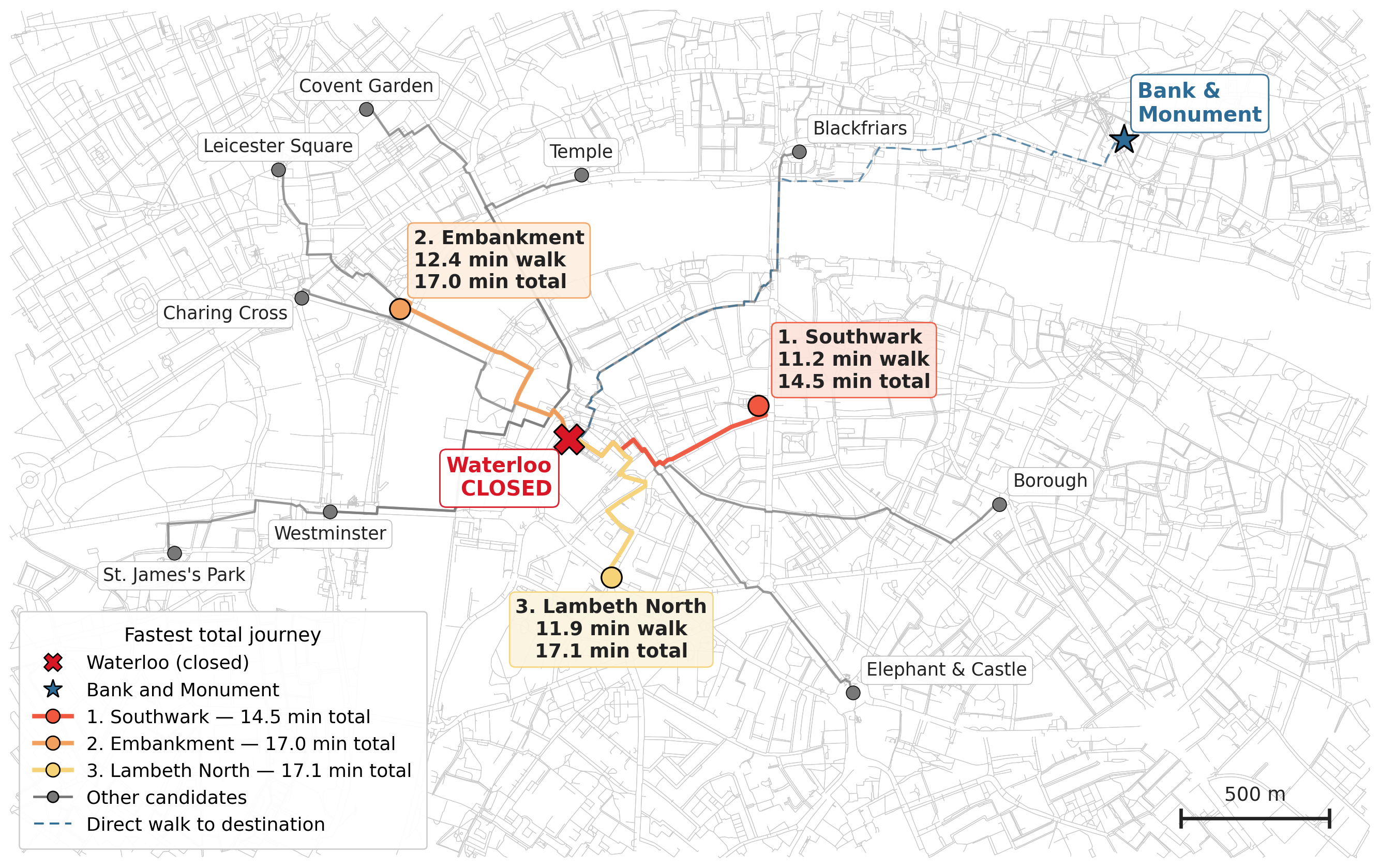
If the origin station were closed, which station should passengers go to instead, and how long would it take them to walk there? These are questions network analysis can answer directly.
Candidate stations were first identified within 1,500 m Euclidean distance of the affected station.
| Rank | Station | Straight-line distance (m) |
|---|---|---|
| 1 | Lambeth North | 486 |
| 2 | Southwark | 649 |
| 3 | Embankment | 721 |
| 4 | Westminster | 841 |
| 5 | Temple | 891 |
| 6 | Charing Cross | 1,021 |
| 7 | Blackfriars | 1,244 |
| 8 | Elephant & Castle | 1,284 |
| 9 | Covent Garden | 1,306 |
| 10 | Leicester Square | 1,337 |
| 11 | St. James’s Park | 1,386 |
| 12 | Borough | 1,471 |
For each candidate, walking distance from Waterloo was computed as the shortest path on the OSMnx pedestrian road network. Assuming a walking speed of 1.3 m/s (“The Planning for Walking Toolkit,” 2020), this yields a walking time. Tube travel time was then added, based on the shortest path through the Underground network to the destination station. Two rankings follow: the closest station on foot, and the fastest overall journey.
| Rank | Alternative station | Walking time (min) | Walking dist (m) | Tube time (min) | Total travel time (min) |
|---|---|---|---|---|---|
| 1 | Southwark | 11.2 | 873 | 3.3 | 14.5 |
| 2 | Embankment | 12.4 | 965 | 4.6 | 17.0 |
| 3 | Lambeth North | 11.9 | 931 | 5.2 | 17.1 |
| 4 | Temple | 17.8 | 1,390 | 3.3 | 21.1 |
| 5 | Westminster | 16.0 | 1,251 | 5.7 | 21.7 |
| 6 | Blackfriars | 19.8 | 1,544 | 2.1 | 21.9 |
| 7 | Charing Cross | 16.8 | 1,314 | 5.2 | 22.0 |
| 8 | Elephant & Castle | 19.0 | 1,483 | 3.7 | 22.7 |
| 9 | Borough | 22.4 | 1,746 | 2.3 | 24.7 |
| 10 | Covent Garden | 20.7 | 1,613 | 5.2 | 25.9 |
| 11 | Leicester Square | 21.7 | 1,695 | 5.8 | 27.5 |
| 12 | St. James’s Park | 25.3 | 1,975 | 6.6 | 31.9 |
The fastest alternative journey runs through Southwark at 14.5 minutes.
Walking times across all candidates range from 11.2 to 25.3 minutes, so the burden of disruption falls unevenly depending on where within the station’s catchment a passenger begins.
6. Reflections and Limitations
Representing stations as nodes and the links between adjacent stations as edges is a simple but powerful concept. This enables the computation of network centrality measures that assess whuch stations carry most structural weight. The sequential removal of nodes reveals how much the network can lose before it fractures. Shortest-path algorithms show which viable alternatives are most efficient when a station closes.
Findings depend on whether a topological or weighted network view is adoppted. Stratford leads the topological rankings but falls to sixth once passenger flows are attached, while Green Park rises to first. Neither is wrong, they just describe different kinds of importance. A station can be structurally pivotal while carrying modest demand, or the reverse. For planning, that means taking into account both views when deploying resilience enhancement measures.
Some simplifications are worth noting. This model treats travel time as proportional to distance, setting aside dwell time at stations, service frequency and the cost of changing lines — which matters most where alternatives are separated by a minute or two. The removal experiment also assumes displaced passengers disappear, when in practice they redistribute onto neighbouring stations. Coupling the network structure to a demand-assignment model would capture that cascade, and would be a natural next step for further analysis.
This article was partially drawn from my coursework for the CASA0002 Urban Simulation assignment.
Source code and data can be found here.
References
Barnett, J. H. (2009) “Early Writings on Graph Theory: Euler Circuits and The Königsberg Bridge Problem,” in Hopkins, B. (ed.) Resources for Teaching Discrete Mathematics. 1st ed. Mathematical Association of America, pp. 197–208. doi: 10.5948/UPO9780883859742.026.
Newman, M. E. J. (2010) “Measures and metrics: An introduction to some standard measures and metrics for quantifying network structure, many of which were introduced first in the study of social networks, although they are now in wide use in many other areas,” in Newman, M. (ed.) Networks: An Introduction. Oxford University Press, p. 0. doi: 10.1093/acprof:oso/9780199206650.003.0007.
TfL (2025a) “Crowding.data.tfl.gov.uk.” TfL. Available at: https://crowding.data.tfl.gov.uk/ (Accessed: April 20, 2026).
TfL (2025b) “FOI Reply - FOI-0318-2526,” Transport for London. Available at: https://www.tfl.gov.uk/corporate/transparency/freedom-of-information/foi-request-detail (Accessed: April 20, 2026).
“The Planning for Walking Toolkit” (2020).
Vries, J. de (2004) “Exponential or Power Distance-Decay for Commuting? An Alternative Specification.” doi: 10.1068/a39369.
Wilson, A. (1971) “A Family of Spatial Interaction Models, and Associated Developments,” 3, pp. 1–32. doi: 10.1068/a030001.