UCL CASA · URBAN DATA VISUALISATION · 2026

Pathways to
Progress

Investigating how transport connectivity shapes secondary school choice and access to opportunities across London.

Scroll to explore

Every morning, close to 600,000 children travel to secondary schools across London.

But, how does where they live shape the schools, and opportunities, they can access?

Most students can reasonably access a secondary school near home.
However, not all schools offer the same opportunities.
In reality, access to choice schools (and better opportunities) often depends on connectivity — where you live shapes what you can reach.
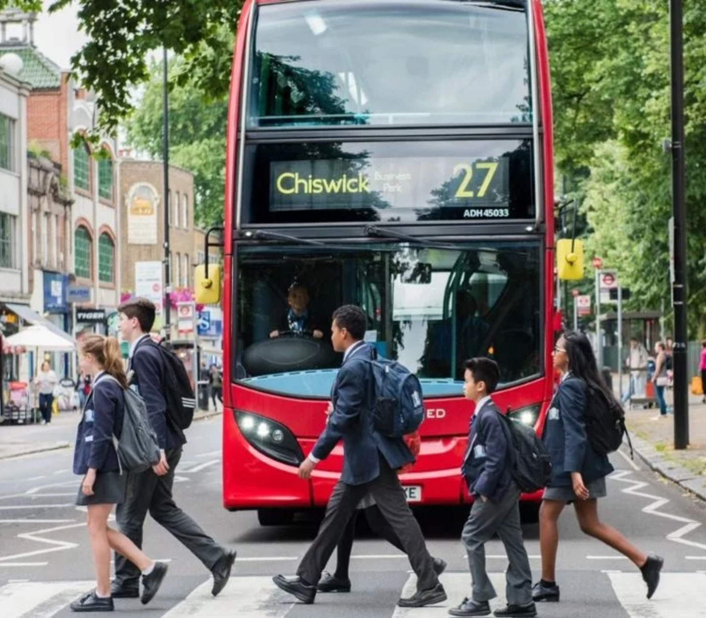
Children travelling to school in London

Photo: Hounslow Council Images

All secondary schools — London
Secondary schools
School location

01 — Context

Across London, approximately 500 secondary schools serve more than 560,000 students, aged 11–16

567,000
students
~500
secondary schools
~91%
avg utilisation

Mapped across the city, these schools appear to be broadly distributed. But this distribution tells only part of the story.

Each dot represents a school. However, what it cannot show is the quality of education of the school, its admissions policy, or how long it takes a child in any given neighbourhood to reach it.

Click on each dot to find out more about each school.

02 — Connectivity

Some children have dozens of schools within reach

A child living in inner London — like Clapham North in Lambeth — can reach up to 96 schools within a 45-minute transit journey. Multiple tube lines and bus corridors fan outward in every direction.

02 — Connectivity

Others, including some in outer London, face far fewer options

In a bus-only outer London neighbourhood — like Harold Hill in Havering — that same 45-minute window reaches just 7 schools. The transit network simply does not extend here with the same density.

Click the buttons below to compare the two areas:

03 — What we explore

We investigate how school access varies across London using three lenses


01
Baseline access
How easily can students reach any secondary school?
02
Access to opportunity
How does this change for Ofsted-Outstanding schools , and schools with strong Progress 8 scores?
03
Pockets of vulnerability
Where might poor connectivity and deprivation affecting children intersect?


Travel to school

How do London's children get to school?

Understanding how children travel, and the barriers they face, sets the context for examining whether all children can realistically exercise school choice.

Chart 1
71% of students live in Outer London compared to 29% in Inner London
Source: ONS Population Estimates, Population in LA by single year of age (11-16)
Chart 2
Walking or cycling is the preferred mode of travel to schools for most students
Source: DfT National Travel Survey 2017–2024, Trips to and from school by main mode and region
Chart 3
Most Boroughs have schools operating within capacity, but some are oversubscribed
Source: DfE SCAP 2024, Pupils to places ratio for schools in Borough (%), Non-selective schools
Chart 4
More students in London travel outside their boroughs to school compared to the rest of the UK
Source: DfE Schools, Pupils and their Characteristics 2024
0%
of London secondary students are educated outside their home local authority

London has the highest rate in England — illustrating willingness to travel for opportunity. But how many children actually have the means to do so?

How does travel time change
when quality matters?

We layer Progress 8 scores and Ofsted ratings onto the accessibility analysis — and find that filtering for quality significantly extends the journeys many children must make.

School access across London

Photo: Gary John Norman / GettyImages

All schools
Travel time — Transit
< 10 min
11–20 min
21–30 min
31–40 min
More than 40 min
Nearest school
Top 25% P8

01 — Baseline Access

Across London's LSOAs, the median travel time to the nearest secondary school appears relatively healthy

0 min
median transit time
Nearest school

The map shows travel time from each LSOA to its nearest secondary school.
Dots mark every secondary school in London.
The map's color intensity provides a sense of travel time via transit (i.e. bus & rail).


02 — Quality Access

However, adding a quality threshold extends the median travel time by 50%, with larger increases in some places

Once we filter for non-selective, high progress schools, median travel time rises — because fewer schools qualify and they are not evenly distributed across the city.

0 min
median transit time
Nearest Top 25% Progress 8 School
0 min
median transit time
Nearest Ofsted Outstanding School

Highlighted dots show qualifying schools for the selected metric:
Top 25% Progress 8 scores and Ofsted Outstanding ratings.

Use the buttons to toggle choice metrics, and the slider to compare travel times.

Distribution of Travel Times by School Type and Mode
All schools
Transit — any school
< 10 min
11–20 min
21–30 min
31–40 min
More than 40 min

03 — Mode comparison

Access differences become even more apparent after accounting for travel modes

Select a school type and travel mode to update the choropleth.
Each combination reveals a different dimension of potential access inequality.

School type
Travel mode

04 — Borough summary

Differences in median travel times across Boroughs reveal opportunity gaps

Median travel time to nearest Top 25% P8 school · by borough

Where deprivation meets
long journeys

Using spatial clustering methods , we identify neighbourhoods where high transit times to Progress 8 schools coincide with elevated child deprivation — compounding barriers to opportunity.

Vulnerable neighbourhoods in London

Photo: Matt Cardy/Getty Images

Clustering by Transit Time to P8 Schools and Deprivation
LISA cluster type
High–High (vulnerable)
Low–High
High–Low
Low–Low
Not significant

01 — Spatial clustering

Pockets of compounded disadvantage exist across London

In outer London — east, north-east, and north-west — children face both high transit times and high deprivation , a double penalty where geography compounds disadvantage.

In contrast, west and south-west London shows short commutes with low deprivation reinforcing one another — families live on the doorstep of the city's best schools, underwritten by suburban affluence and car ownership.

Most strikingly in inner east London, we unexpectedly find fast access and high deprivation. If students here are still falling behind, the barrier likely isn't transport — it's likely social, administrative, or admission-based.

Red clusters mark where disadvantage is compounded. Hover over clusters to view details.

02 — Cluster Deep Dive

1 in 10 children live in areas with high transit times and high deprivation

Toggle the buttons below to explore how many children live in each cluster and to compare access to quality schools across clusters.

Each square ≈ 1% of all London 11–16 children

65,002
children
10.0%
of children in London aged 11–16
IDACI score
0.619
London median: 0.42
Transit → top P8 school
32 min
+7 min vs London median (25)
Walk → top P8 school
— min
London median: —
Drive → top P8 school
9 min
+2 min vs London median (7)

03 — Income Context

Lower incomes limit the ability of students to overcome access differences in these areas

On average, households in areas with High Transit Times and High Deprivation earn 25% less than the median London household.

Median annual household income after housing costs, aggregated by LISA cluster.

This material difference affects families' ability to manage longer commutes. Lower-income households are less able to rely on private transport or widen their school choices, making them more dependent on public transit.

These children face a compounded challenge: longer travel times combined with fewer resources to mitigate them.

04 — Borough patterns

Borough-level patterns highlight where action is most needed

Enfield, Newham and Tower Hamlets contain the highest shares of such LSOAs.

% of LSOAs in Borough with High Transit Times & High Deprivation (Descending)

Place-specific policy response needed

Outer London: Improve bus networks to affected areas
Inner London: Targeted support to improve access to quality schools

Mind the Gap: Reflections on School Access and Opportunity in London

Access vs Choice
01
Access vs. Choice
How we define access and choice shapes how we understand school accessibility. After accounting for choice, subtle inequalities remain — often reflecting a trade-off between where students live and the opportunities they can reach.
Bridging the Gap
02
Bridging the Gap
Ensuring fair access for the next generation requires a concerted effort. Transport authorities should promote affordable and sustainable travel, especially in outer areas. Local authorities can step up targeted assistance to lower-income families, whilst ensuring good school choice in more deprived areas.
Securing Future Equity
03
Securing Future Equity
As pupil demand gradually falls and school closures become an eventuality, how local authorities think about reallocating resources must keep equitable travel to schools as a planning priority for residents.

Image credits: Gary John Norman / Getty Images  ·  Bruno Figueiredo / Unsplash  ·  Nick David / Getty Images

About

Pathways to Progress

Acknowledgements

Pathways to Progress was developed as part of UCL CASA's MSc in Urban Spatial Science module on Urban Data Visualisation, led by Prof Duncan Smith. The 2026 theme is "Urban Analytics".

We thank Prof Duncan Smith and our PGTA Kayla McInnis for their valuable guidance and input, and extend special acknowledgment to Prof Adam Dennett for his wisdom and insights on the challenges facing secondary schools in London.

Data sources

Agency
Dataset
Description
DfE
GIAS
National register of all educational establishments in England, including location, admissions policy and capacity.
Ofsted
Inspections
School inspection outcomes and effectiveness ratings.
DfE
KS4 Performance
Key Stage 4 attainment metrics including Progress 8 and Attainment 8 scores.
DfE
SCAP 2024
School Capacity Survey — pupil places and capacity utilisation by borough.
DfT / TfL / RDG
GTFS
Integrated public transport schedules across bus and rail networks for transit routing.
MHCLG
IMD 2019
Index of Multiple Deprivation, including IDACI (Income Deprivation Affecting Children Index) at LSOA level.
MHCLG / CACI
Household Income (AHC)
Median household income after housing costs at MSOA level, used to profile cluster socioeconomics.
DfT
National Travel Survey 2017–2024
Mode share patterns for school travel by region.
ONS
LSOA 2021 Boundaries
Geographic unit for travel time analysis and deprivation mapping.
ONS
Population Estimates
Secondary-age (11–16) population estimates by local authority.
Ordnance Survey
OS Meridian 2
Urban area boundaries used to mask analysis to human settlements.
GLA
London Boundary
Official geographic boundary for Greater London.

For more details on the metadata for the schools database, please click here.

Our team

Benjamin Tee
@benjamintee
Benjamin is a public servant and is passionate about data-driven and evidence-based policymaking. He is excited about making maps and good visualisations that tell a compelling story and motivate positive action.
Tabata Paredes
@Tbtaaa
Tabata is an urban planner interested in understanding cities through data. She works at the intersection of spatial analysis, design and using visualisation to make complex urban patterns legible. She’s particularly interested in how data can challenge and rethink how cities work.
Yujing (Olivia) Xing
@yxing82
Olivia is a mathematician with a curiosity for complex urban systems and a commitment to social justice. She enjoys unpacking difficult problems through logical reasoning and translating them into clear insights to make a difference.